
What Is Responsive Website Design?
Published on 18th October 2016
You may have heard the phrases ‘responsive website’ or ‘mobile-friendly website’ thrown around quite a lot recently – here’s everything you need to know about the latest in website technology.
What is a responsive website?
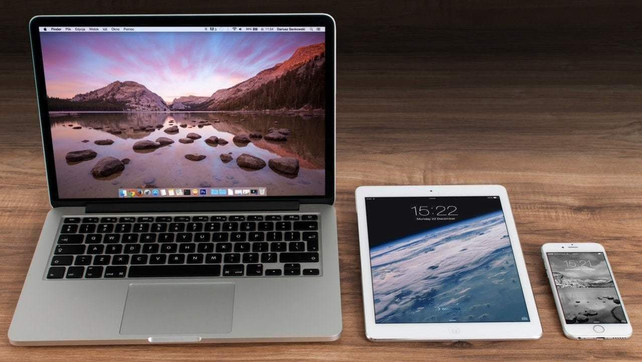
A responsive website is a single website that adapts to any screen size. This means it's as easy to use on a mobile phone as it is on a desktop computer – no pinching or horizontal scrolling required.
The website design instinctively adapts to the device it is being viewed on, so it looks great on a mobile, tablet, and desktop.
You can take a look at our website design portfolio to see examples of responsive websites.
Why does your business need a responsive website?
If your website is not mobile-friendly, then it will not be easy to view for the 38 million smartphone users in the UK, which could be losing you valuable business.
60% of people won’t stay on your site if it’s not mobile-friendly.
67% of people are more likely to buy a product or use a service from a website that is mobile friendly.
This is why Google ranks mobile-friendly websites above non-mobile friendly websites in the search results – and why you’re at risk of missing out on mobile customers, as they are likely to be going to your competitors’ responsive websites instead.

Why is a responsive website better than a mobile website?
You may already have a separate mobile website – this is a second version of your company website that has been designed for mobile users only – and think this means you’ve got mobile-friendly web design covered.
However, with responsive web design here to shake things up, that may not be the case – here’s why a responsive website is better for your business:
Responsive websites work effectively whatever device they are viewed on, and all website pages are always available – so your customers can enjoy the same great website experience whether they’re viewing your site on a smartphone, laptop, or desktop computer.
Responsive websites load faster than mobile websites – saving valuable seconds and encouraging visitors to stay on your site. According to Google, 40% of people abandon a website that takes more than 3 seconds to load.
A single responsive website is more effective and less time consuming than separate desktop and mobile website versions:
• You only have one website to manage and keep updated.
• You only have one site to optimise for search engines, so your SEO efforts won’t be diluted and you have the opportunity to appear high in the search results for both desktop and mobile users.

How could a responsive website from it’seeze benefit your business?
At it’seeze, we create websites that are professionally designed, affordably priced - and fully responsive.
With our responsive web design services, your website will:
Look great and perform brilliantly on every device.
Make it easy for customers to quickly find the information they’re looking for.
Seamlessly display videos, social media feeds, booking forms, and more.
Be quick and easy to update using our unique website editor.

Why not get in touch with our friendly team today to find out more about how our responsive website design services could help you reach customers on all devices – from smartphones to desktop computers.
Tagged as: web design, website maintenance
Share this post: